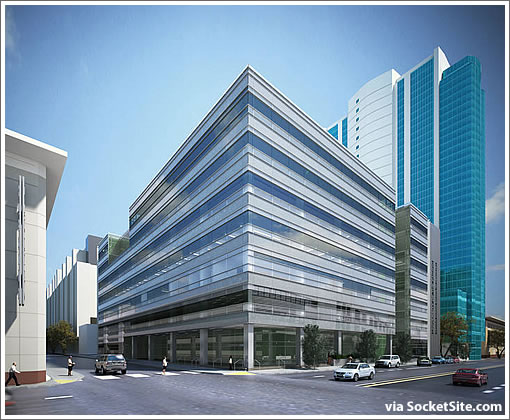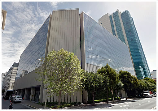
As we reported last year, The University of the Pacific purchased the seven-story building at 155 Fifth Street with plans to reface and renovate the building with the first five floors to become the University’s School of Dentistry while the top two floors will be leased.

The SmithGroupJJR has been tapped to lead the redesign of the existing building which is expected to reopen (wide) by the middle of 2014.
∙ 155 Fifth Street Refacing, Renovation And Repurposing In The Works [SocketSite]

Concord and Pleasanton both just called; they want their office building back.
In the previous rendering there was more of a grid pattern with the vertical beams expressed through the exterior. I liked that a lot better than this heavy horizontal stripe look. On the bright side, the corner and ground floor are certainly big improvements over the existing building.
SF is the ugly duckling: the city with no curves — and no personality.
Curves?! This is a city… leave the curves in the sprawly suburban tech centers.
AND SF has more architectural / urban character than most cities I’ve been to in the states. Character comes from age, interaction and distinction… character that is “designed” is often shallow and quickly disregarded… very much like the design that’s in the process of being replaced here.
I often fear that San Francisco’s slow and awkward growth will only be measured by opinion and aesthetic, rather than innovation and transformational thinking. (Smart can be pretty too.)
Although I find both versions of this building very disappointing, what I am most interested in is this trend of changing facades to suit current fashion and tastes. Although the choice of a new “skin” may be appropriate for ugly ducklings like 155 Fifth Street, what about an iconic tower such as the Willis (used to be Sears) Tower in Chicago that is scheduled to receive a new facade skin? I happen to be a fan of some of the modernism of the 50’s – 70’s and hope that some towers will be left to represent the time in which they were built.
“leave the curves in the sprawly suburban tech centers”Really? You must not have ever seen/been to downtown Shanghai.
I like the new version of the exterior skin a lot: slick, horizontal, open, reflective. Especially the corners; much more cleaned up and functional.
More often these days new exterior skins of older buildings are not really done just for a “trend” or for “current fashion and taste”. Many new glass/metal/curtain walls are far more energy efficient and have lower maintenance costs.
With regard to this particular building, most would agree it was a pretty ugly dated exterior of about the mid 80″s designed by SOM.
@ugh Touché. Although, in San Francisco we tend to see more of this: https://socketsite.com/archives/2012/02/the_arquitectonica_redesigned_201_folsom_street_renderi.html than what you just pointed out.