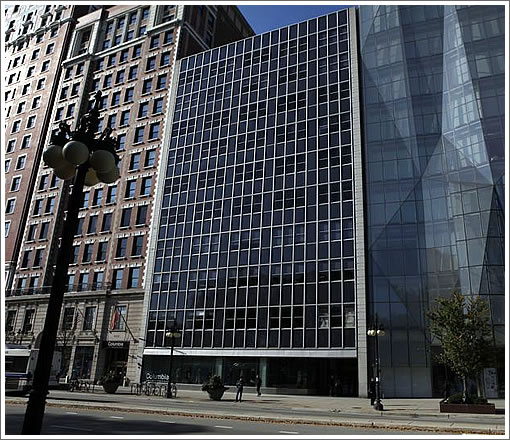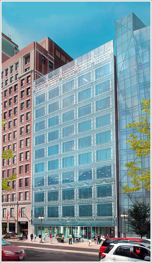
From the Chicago Tribune with respect to the proposed lipstick for 618 South Michigan Avenue on Chicago’s historic Michigan Avenue Streetwall which suffered from “a bad modernist makeover” in 1958:
On Thursday, the Commission on Chicago Landmarks will pass judgment on the latest proposal for [618 South Michigan]. Columbia College, which has classrooms, faculty offices and other facilities inside the building, wants to ditch the dreary, single-layered 1958 façade for a new double-layered wall of energy-efficient glass. But this would be no ordinary glass wall.

With the aid of digital ceramic printing technology, the glass will be imprinted with a ghost-like image of the building’s original façade. Though the technology has been used before, Columbia is touting the large-scale historical recall as a first of its kind. The architect, Elva Rubio of the Chicago office of Gensler, compares the veil-like design to the Shroud of Turin.
In the words of a tipster: “Could this be the answer to every San Francisco Planning concern? Hate the facade? Just print out a new one and paste it to the building…”
∙ A digital makeover for Michigan Avenue high-rise [chicagotribune.com]
… or go all the way and use LCD technology to dynamically change the facade appearance in real time. Combine it with retina scan technology a la “Minority Report” and the facade can change appearance depending who’s looking at.
Yes, you *can* please everyone.
(Interestingly a dynamically changing face has already been built across the street : the Crown Fountain)
This is more postmodern than the Postmodernists ever dreamed. I find it both horribly nostalgic and surprisingly futuristic. If anything, it’s a brilliant transition between its two neighbors… traditional and modern merged into an original synthesis.
Isn’t this similar to the planned but much-hated Prada store facade on Union Square? So no, it may not please everyone.
Clever. There’s no longer any excuse for presenting a sheer unadorned glass curtain wall to the outside world.
As a bonus, it also performs a massive gamma correction on the adjacent buildings.
The cheese-grater Prada store that didn’t happen was not at all like this. It was to be wrapped in perforated metal with no reference to historic styles. But I’d LOVE to see the Union Square Saks rehabbed this way.
You could probably also turn it into a massive advertising billboard while still allowing visibility out of the windows. That would help the pro forms pencil out better. Might as well go all the way if turning postmodernism on its head.
Great technology.
Silly application of it.
But it solves the bird problem!
“If anything, it’s a brilliant transition between its two neighbors…”
I didn’t notice that until you mentioned it. You’re right, brilliant!
I kind of like the old one…
But still I think their new idea is awesome, and looks really cool.
Its worth a shot, but I have my doubts.
Buildings from that period get so much of their presence from the texture of the masonry, the shadow of the recessed window, the various planes in the facade. Projecting the facade into just one plane is just creating a new kind of facade. Already, in the renderings, the window openings appear to be more horizontal, while in the original, they resolve into a trio of vertically oriented windows.
I’d prefer to see the original facade rebuilt, with enough simplifications to the level of detail to make it economical and achievable using the reduced skill level of today’s tradespeople. But nobody would be writing about it in a blog if they did that.
@around1905
“But a traditionalist might wonder: Why not just install new terra cotta that would replicate the original design?
Alicia Berg, the former Chicago planning commissioner who is Columbia’s vice president of campus environment, has a ready answer: It would cost too much—an estimated $8 million to $10 million, versus $2.5 million for the new glass.”
I’m not sure they would have to replicate the original exactly; just bringing back a masonry facade with all the windows set at the right depth and the right size would be enough to bring back the feeling of the street. A few companies have, in recent years, brought back old masonry and its beautiful stuff.
A possibly more practical obstacle is that there are almost no architects or designers capable of even this simple task — ‘traditional’ stuff isn’t taught in architecture schools here, except I believe for Notre Dame. So they are stuck trying to replicate things exactly since they don’t know enough to be able to simplify the design and keep it spirit, or else they give up and doing something ‘new’.
An additional obstacle is that most contractors will bid very high for this kind of work as they have no experience with it. But the right contractor would come in at a more reasonable cost.
So in the end, I think it could be done in a ‘traditional’ way but it would require work to find the right architect and the right contractor and nobody would get any brownie points for that — so much more noteworthy to etch a scan of a facade drawing onto glass and hang it all up like a shroud. The 1950s reno guys probably followed the same line of reasoning….
Anyways, its worth a shot. Its just one building and it would indeed be wonderful if the new facade ‘worked’.
In Chicago? Maybe we can do something cool like this here, too.