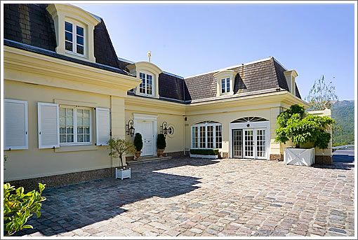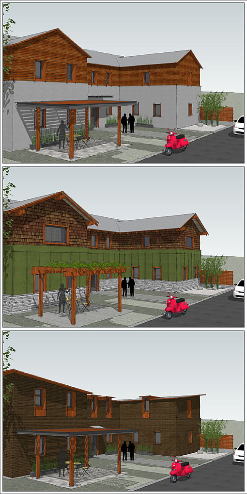
A couple of readers dig up yet another website for 1650 Indian Valley Road (yes, “La Pigeonniere”) as well as a few drawings by architect Daniel Strening which, according to the listing, show the “transformation possibilities representing today’s lifestyle.”

French villa living is so 1600’s. Or in this case, 1971.
∙ How To Spend $3,995,000 (But “Save” $5,255,000) Up In Novato [SocketSite]
∙ 1650 Indian Valley Road: Website | Architectural Drawings [1650indianvalleyroad.com]
∙ Daniel Strening, Architect [streningarchitect.com]

What are they thinking? I suppose if I were an architect and someone came to me with a perfectly fine house I’d try to scare them away from ruining it too – as long as I got paid for the sketches I could come up with all sorts of horrible ideas.
There is only one certainty in the fate of La Pigeonniere : there will be a red Vespa parked in the driveway.
It’s rare that a 1971 pseudo-French suburban house could be so exponentially much better than a potential “modernization” of it, but that is certainly the case here. I hope you’re right Charlotte.
Ok,I got my magic markers and I got some sketch paper and you want me to turn this into a commune for Dwell readers. Sure! You did pay the retainer fee already, right?
Agreed with all of the other comments. Someone could totally work with the existing architectural style and layout. This could be a stunning home.
I hope whoever buys it will not be swayed to turn it into something destined to be showcased on http://www.unhappyhipsters.com.
I’m not a big fan of mansard roofs and etc. But, these sketches are horrid.
They look like….public housing.
I take it that is supposed to be a bus stop shelter in front. Then, the red Vespa is parked in the bus stop zone.
They’ve got to be kidding!
Well…unhappyhipsters is a fun site, admittedly. they do poke fun at the sometimes stark, but elegant, houses featured in Dwell.
Some people do like simple, clean, modern spaces.
Whoever did those sketches should be fired.
I’m not an architect, don’t play one on the Internet, and don’t know how many people that Daniel Strening has on staff in his office. That said, I’m going to guess that these alternatives were pumped out by a junior associate, perhaps a year or two out of college, using inexpensive CADD software like SketchUp, and hence what you’re seeing in the lower three renderings didn’t take more than two days work at the absolute outside.
The “ugliness” is probably because Mr. Strening’s associate was thinking about LEED certification (or compliance, or what have you), and it seems like a side effect of that (IMHO) that most traditional styles, even ones like this ersatz French villa, get dispensed with in the process of producing something sustainable.
Some of you are taking those very conceptual sketches far too seriously, and literally.
jeeeeezzz. they are just concepts. They are usually developed for a client to begin the dialogue and design process.
Besides, any one of the 3 are far more interesting than that piece of crap fake french Mcmansion.
“Besides, any one of the 3 are far more interesting than that piece of crap fake french Mcmansion.”
They are? These sketches seem oddly lifeless and almost institutional to me. Perhaps it’s because all the windows are so much smaller and they are all the same. The poster above had it right when he (she?) said it looks like public housing. It looks like apartments or a private day school rather than a single family house.
I’m no fan of crappy, fake French architecture. The Mansard roof, the arched windows, the fake shutters, the total pretentiousness of it all gives me a bad case of the heebie jeebies. But sometimes the horrible is better than the alternative(s).
That’s not to say that no architect could overhaul this house and make it much, much better. I’m sure noearch, for example, would do a super job.
Man, those “sketches” are insult to injury. Junior in the firm, indeed…or else intimidating client.
Who on Earth would ride a Vespa in Novato anyway?
Leeds cert remodel: it is going to take some fast talking to convince me that doing unnecessary construction on a serviceable property is going to lower the house carbon footprint when you include the full carbon cost.
First I thought the drawings were for a conversion to professional office space till i figured out it was a SFR, then I figured someone needed to spend more than $9.99 a/r on a drafting program and an hour learning to use it.
This is a real mansion no Mc, and the shutters are functional there are hinges, dogs, they sit proud of the wall, and are properly sized.
This house is never going to make Dwell, AD, or even Sunset, but somebody liked it they spent a lot of time and cash on it (wasn’t anyone I know), so isn’t it time to kick the roomies out of the LR and pull out the sofa bed so you all can be on time for your Kinko’s shift.
BTW the house is b___ ugly. I am just in a bad mood because I found out tonight that my neighborhood is filling up with under and over aged hipsters.
Since French “chateau” is out. Wouldn’t it be an easier and more graceful transition to a tasteful French Provence villa? Change the roof, tone down the colors, keep the cobblestones and the windows…. and put in a trellis with grapes. Something like this:
http://kinghome.com/imgcache/i/XL/0/pi_7182279384a112006a77302.15328453.jpg.jpg
Not that I care for any of them, but some of the modern designs do look more like a pigeon coop…
One of these days I’ll snap a photo of probably the worst faux chateau I’ve ever seen. It is between Los Gatos and Almaden Valley in the bucolic environs of the Guadalupe landfill.
It is pretty clear that the client told their architect that they wanted a French country chateau look. But the architect allowed the timber framed and stock component construction methods show through. Everything is noticeably out of proportion. The result is a huge (at least 10000 sq.ft.) cartoon of a home that makes Disneyland’s attempts look like the work of a master forger.
Yes, it is hard to make a timber framed house look as if it were built from stone though it can be pulled off. I’d expect you’d have to pay a significant premium to get a true authentic look.
I just looked for the house on Google streetview and was surprised to see that it looks to have been crudely photoshopped out, probably at the request of the homeowner. (You can see a faint ghost of a house near the center against the hills) Were they embarrassed at this huge flop or just paranoid ?
Ha ! I found it and it is actually for sale at $8.5M. I overestimated the size, it is only 6000 sq.ft. Gaze upon it only if you dare.
At $8.5M this seems like a deal since it sits on 30 acres. Aside from the proximity to the landfill this is a pretty good location. If those 30 acres were sub-dividable down to 10,000 sq.ft. lots then this would be easily worth $20M for the land alone. So I’d guess that this is locked under something like the Williamson Act and cannot be subdivided any further.