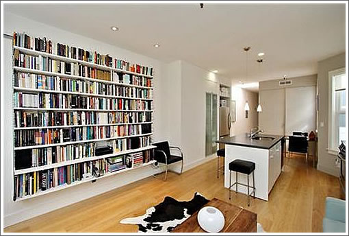
We’d call it an apples to apples sale to be for 75 Lily #4, but while the sale price of $489,000 in April 2008 is reported on the MLS, it appears that the recorded selling (“75 Lily Street”) and purchasing (“75 Lily Street”) parties might have been one and the same.
Regardless, back on the market as of yesterday and asking $449,000 for the Hayes Valley one-bedroom TIC today. No mention of the address in the 2010 condo lottery results.
And yes, we know walls of books and earthquake zones aren’t a great match, but we do have a soft spot for the look (albeit a little less so when careening towards one’s head).
∙ Listing: 75 Lily #4 (1/1) – $449,000 (TIC) [MLS]
∙ San Francisco’s 2010 Condominium Conversion Lottery Results [SocketSite]

When are the stagers going to stop with those animal skin rugs!
I’m glad this unit is a “great place for resting” (see MLS listing). I always hate it when I can’t get to sleep in my own home….
If buying this TIC would be not needing a car, then why is there nothing but concrete and a clunker out front? Plant a tree already!
or at least add some color to the victorian facade. white on white not the best choice.
Greg, you beat me to it–I came to the comments to say the same thing. The dead cow hide rugs in all the listings are past ridiculous.
Mole Man wrote:
Because although one wouldn’t need to have a car to “Walk to the Opera, Symphony, Art House Movie Theater, plus Restaurants Such as Zuni and Absinthe”, to quote the listing, one would have to use a car to get to the TIC, since it’s being billed as a pied-à-terre. From the listing:
This also answers curmudgeon’s question, above. The target market is probably some high-earning financial district type who wants a place for discreet rendezvous with the escort he has on retainer, a la Tiger Woods, Elliot Spitzer, Charlie Sheen, etc., before he heads home to the wife and kids in Mill Valley. Think Elias Koteas’ character in the 2008 art house movie “Two Lovers”.
Yet another completely undisciplined realtor who thinks its great to take 30 pictures of nothing and subject us to them because digital photography is free. Damn. One floor plan and five well-composed pictures would tell the whole story with lots less aggravation and lots more information.
The SMALLEST remodel in an old victorian building..
It’s nice to see a cool remodel of such a small space and I think white is the perfect “color” for the exterior.
I think it’s a cool pad too. Plus it’ll be a great comp for my upcoming 2/1 tics. If this 1/1 is $450k…sheeeet…I should be safe at $450k for my 3- 2/1 units. Sweet!
I also like the remodel and the nice fantasy marketing done by realtor, but 33 pics is too much. 8-10 is plenty.
OK. We get it. The place comes with a built-in bookcase.
You guys complain constantly of no pics on other listings, now it’s too many? C’mon, that’s a little rich.
“You guys complain constantly of no pics on other listings, now it’s too many? C’mon, that’s a little rich.”
Right, because clearly all comments are either black and white and there are no shades of gray based on the circumstances.
FWIW, I thought there were a few extraneous photos here, but I wouldn’t have thought of cutting it down to 5.
Quality of work in this building is not to a very high standard. Apartments are also quite small. Is the developer still trying to sells these after 2 years?
Cute building. I like the white too. Twenty years ago a building like this would have been painted twenty different colors.
^ yup. Post-modern Victorian, anyone?
Tipster likes to call Peninsula tech irrelevant when it is convenient, Auden. Don’t ask Tipster for accountability. He lacks any shred of it. The fact is that now that Cisco is in, nearly all of the local big tech companies have surpassed expectations.