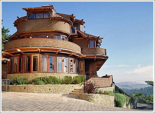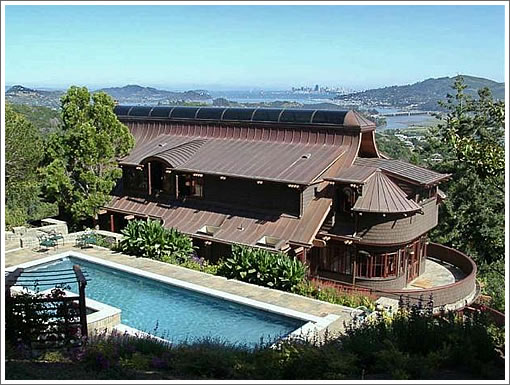
Atop a grassy knoll (and 1.33 acres) of its own, 1 Via Vandyke across the bridge in Mill Valley offers some big city, Marin and bay views, 7,545 square feet of living (6,925 in the main house plus 620 in the cottage) and an “Arts & Crafts design with Asian influence.”

Built in 1999, it’s been on the market for a month and asking $6,900,000. And it’s a who’s who of hardwoods used throughout the house: Honduras mahogany, Bubinga, Wenge, Macassar, Anegre, Padauk, Maple, Brazilian Cherry, and Teak.
It looks like someone stuck a bunch of shingles on a treehouse fort. 🙁 🙁 🙁
Don’t understand the “Arts & Crafts … with Asian influence” thing. I was similarly confused by “Asian-Craftsman” in this Burbed post:
http://www.burbed.com/2009/12/08/press-release-for-a-los-altos-house/
for this Los Altos house:
http://www.redfin.com/CA/Los-Altos/12977-Cortez-Ln-94022/home/913518
Of course, this Mill Valley place does have the koi pond that the Burbed post mentions. Nice place with nice views, but I wonder if it will fetch this price.
(I’ll let someone else comment on the words “flat panel tv above mantel” in the floor plan.)
RIP: forests
Isn’t this house shown in the third Star Wars movie? You know with all the furry bear midgets?
Jessep, you’re confusing the Ewoks w/ the brokers.
The question is…how many rain forests does it take to build a house in Marin. Oh my bad…I’m sure it was all eco friendly.
From the rear it looks like a steampunk riverboat.
All I can say is Wow! This is one tricked out looking house from the photos. Looks very tranquil. Wish I were in that bracket. I certainly appreciate the use of materials and placement for views. I am guessing that the list price adjusted for land cost is under replacement cost.
Why is it that so much negativity has to be focused here at Socketsite. But alas, that is what creates the hits, I guess. The watercooler of complaining about something, anything. I wonder if the negativity will ever turn to positive once things turn around ten years from now. Hmmmm…..
Okay, so not to be negative…it’s a pretty incredible home. Over the top, and depending on your perspective that’s good or bad.
What I find interesting about the voluminous information available on the website, is that nowhere (that I saw) is the name of the architect mentioned. It is “influenced” by the later works of Frank Lloyd Wright and Green & Green. Meanwhile, every variety of wood and granite is named and provenance described… very odd.
Agree fully with honestly_now. I want this house!
“From the rear it looks like a steampunk riverboat.”
Or Jabba’s Sail Barge…
Koi pond in the foyer. Weird/gross. Koi ponds should be outside.
I’d love to know who the architect was, if there really was one……:(
Somebody had fun with a circle template and a bunch of shingles…immature design for sure.
It took me a while, but they finally did win me over and I thought I’d be content living in the guest cottage. Then I hit the “Morning Tea on the Terrace” [very bottom of the page] under Additional Photos Part Two (not only did they cut down a rainforest, they nabbed some of the displaced animals, too!)
I think the designer was WalkerSFDesign
see: http://www.walkersfdesign.com/clients.html
They tie to a Mill Valley project with cross referenced name,
Still have not found the Architect
When you start making insane amounts of money, you reach a fork in the road: do you adopt this lifestyle, the humongous house, the trophy wife in her fur coat, etc., thereby requiring you to maintain the level of income even when it may not be desirable (or possible) for you to do so, or do you realize that life is less complex if you avoid all that, and live a bit more humbly.
No one really needs 6900 square feet, heating a three story space would cost a fortune, and don’t get me started about how silly someone looks trying to commune with nature while mowing it down to build such a palace and heat it.
It sure has some nice features, but I wouldn’t live here in a million years. In the end, you realize that the lifestyle is glamorous only because you lack self esteem: you need a house and wife like that so that people will think you are a somebody. It sort of instantly validates you to your friends. When I was inches away from buying a palatial home (and marrying the trophy wife), I realized I didn’t need to prove anything to anyone. I’d rather give my money away to great causes and make a real difference, than send it to PG&E.
But different strokes: for someone who feels the need to prove themselves to the world, this place will certainly do the trick. The indoor koi pond should make for a fun sushi party at the end of a drunken evening. Can’t get any fresher than that: you don’t even have to bring it in from the outside!
ovoid living space
compensating empty soul
live in monster truck
Interesting, given all our talk about commercial real estate, lately. This home was brought to you by the man who gave us commercial condominiums…
I’ve always wanted a Washer/Fryer! What an awesome combo. I assume big enough for a Thanksgiving turkey, while still doing a commercial-size load of laundry.
Heating three stories of space can be relatively in expensive if you design right. Radiant heat, southern exposure with excellent insulation and dbl pane windows. My PG&E bill is $180/mo avg during the year for 4800sft in SF.
Cannot speak to the lack of self esteem issue relative to the owner. In my case it was thirty years of humble living, scrimping and saving (no humungous money though), helping others, and large dose of naiviete LOL! It was a creativity outlet and challenge to work with my hands. I will never do it again in this lifetime.
Still, I respect what someone created with a feeling of warmth and detail. The craftsmaen that did the work, the managers that put it all together. THEIR work does not speak to lack of self esteem, rather the opposite in my book.
Again, looking at positive as well as negative issues.
Did someone say Frank Lloyd Wright? I don’t see that at all.
And for the record, my house looks nothing of that caliber.
Pretentious dwelling
Provokes competing viewpoints
Sermonizing too
On December 15, 2009 12:27 PM, curmudgeon wrote:
Sorry; I realize this is a tangent, but I can’t just let this pass in case someone with little formal knowledge of architectural history comes across this comment; someone who’s never visited Pasadena.
Our “curmudgeon” intended to write Greene and Greene, with an “e” at the end of the name, as in Charles Sumner and Henry Mather.
Measure of self-worth
How much space your stuff takes up
Resources wasted
Sorry Brahma, I typed too quickly. I certainly know who Greene and Greene are. And yes, the website quotes the suppposed antecedents, but doesn’t mention the actual architect who was so inspired. As to anonn’s comment on Wright…I don’t see much resemblance either, but I suppose that “late” Wright played with rounded forms in the Guggenheim and in the Marin Civic Center. But I think we all agree that it is a stretch to identify this building with any of these architects.
I shouldn’t attempt to compete with Milkshake on this one. I mean “ovoid”, “empty soul”, and “monster truck” in the same Haiku? Too good.
But I can’t help myself…
A hardwood who’s who
But something is not quite right
Granite countertop
I would have referenced Maybeck and, possibly, Albert Hoffman of the Sandoz Labs
Maybeck takes big dose
Poppies surround Hoffman’s bike
Marin LSD
Kidding aside, I’d like to express a little love for the design of this place. While clearly not everyone’s Cup of Ketamine, the architect did attempt to create a unique synthesis of styles. I think that we should encourage architects to take risks even if some are considered flops. Without that adventurous attitude our built environment will stagnate.
However the monster home aspect is a completely separate issue. There are worse examples than this place. Much worse. The low point in that style of giganto house are the ones that look like a catalog of prefab stucco architectural ornamentation. Slap some columns here. Gimme four dozen of those balusters. Put that rosette over here. Look : we can work in another of those eight foot semicircular windows over here.
twelve foot high entry double door : check
tiny antechamber with 20′ ceilings behind front door : check
chandelier hanging from 10′ chain : check
more bathrooms than beds : check
three car garage : check
great room : check
half dozen cheapo fake fireplaces : check
huge granite topped island in kitchen : check
prefab fountain out front (don’t worry about matching styles or even eras) : check
enough square footage to operate an orphanage : check
architectural critiques should say “cup o’ ketamine” more often.
@milkshake: you’ve got to be kidding…”a unique synthesis of styles…”……….huh?
there is no love expressed for that heap of wood, metal and pretension.it’s all about “look at me, I’m special…”
OK, then let me break my statement down :
“unique” – I don’t know of anything else like this. Is there ?
“synthesis of styles” – I’m no expert, but this does look like a combination of at least two styles : Craftsman and Chinese/Japanese (I really don’t know enough about Eastern Asian architecture to tell the difference here)
Again – while it isn’t for everyone, at least the architect took a risk. If you don’t take risks you end up going around in the same circles over and over.
There are enough different styles, shapes, geegaws and woods for ten houses not one. I’d be willing to be there wasn’t an architect – just an experienced builder/craftsman.
no, no, no: good design is not really about “taking risks”..
it’s about having the innate talent to begin with. some do, many don’t.
this one didn’t.
You know, I always thought an Arts and Crafts meets Asian thing would be the natural progression of California design. I just didn’t think it would look like this – in fact, this looks like would have been left on the cutting room floor.
I’m with Noearch on this one – yes it’s nice that it’s not a cookie cutter, but it’s not about being different, it’s about making something that looks nice and works.
(Although “not everyone’s cup of ketamine” does win the thread.”
^ Should read “this looks like what I thought would have been left on the cutting room floor.”