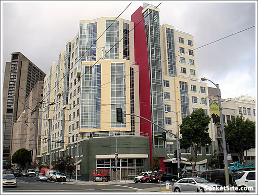
While a couple of months behind schedule, the 12-story Mercy Housing project at 1390 Mission (northeast corner at 10th) is now sporting its full array of colors.
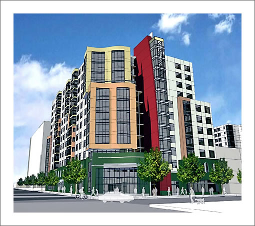
Once again, 136 units of 1, 2 and 3 bedroom affordable rental housing on the way. And not too Inaccurate rendering (although the more open entrance would have been nice).

∙ A 10th And Mission Triptych In Reverse For Mercy Housing Rising [SocketSite]
∙ Affordable Family Housing Rising (And Rendered) At 10th And Mission [SocketSite]

The ground floor corner is hideous. This is why people tend to hate affordable housing – one thing is promised and another delivered. Although there are some good examples design-wise, it’s stunts like these that poison the well for future developers.
I’ve been waiting for the red paint to go on. I’m pleasantly surprised that it didn’t get the washed-out treatment that all the other colors on this seem to have gotten between rendering and construction.
Kudos to whoever took this picture. The angle is perfect compared to the rendering!
also: I’m fairly surprised, but this end product looks almost identical to the rendering IMO. So much moreso than those Saitowitz renderings that try to make concrete look “light and airy”
I’m also glad they didn’t wash out the red. I wish they’d go back and brighten the other colors.
one change I note (aside from ground floor), there is an extra bank of windows just to the right of the Red prominence… they look better than the rendering.
Except for the red, the colors are too muted. Looked better on the rendering. Is the entrance even green? It looks more grey in the actual photo.
Still, one of the few examples where the rendering and final product pretty much match.
Finally a building where the rendering looks somewhat like the actual building. This is a lot better than those ugly glass towers that just look dull green when finished. Agree with prior posters that they should brighten up the colors a little.
I agree with the others. That green is a total miss.
That is on my top ten list of wildest intersections in the city. I strolled down there once and was just aghast at what I saw. Bedlam. Its just gross what the endless spread of low income housing for marginal people is doing to whole neighborhoods in the city.
It looks just like the rendering. UNFORTUNATELY.
I live one block away and am happy I do not see this building from my apartment. It looks like a bunker from WW II. In spite of the paint job it still looks heavy. I know it is possible to design a concrete building that looks good. I’ve come to expect crap when I hear a low income building is going to be built. There must be something in the rule book that says low income buildings must have an institutional look. Another one that Flew Over the Cukoos Nest!
I never understood why low income people need to be put into new housing, while high income people often settle for used. Why not focus on making all new builds of the highest quality and design, and subsidize the older stock if the government must get involved at all? Can you imagine how much nicer our cities would be?
I never understood why low income people need to be put into new housing, while high income people often settle for used. Why not focus on making all new builds of the highest quality and design, and subsidize the older stock if the government must get involved at all? Can you imagine how much nicer our cities would be?