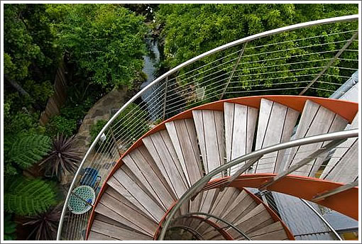
Our first thoughts upon noticing the $100,000 (3.8%) reduction for 76 Caselli: Tips From Brokers on How to Renovate [a NYC] Apartment. (Ironically, “Sellers are licensed real estate agents.”) Our second thoughts? We’re rather enamored with those rear stairs.
∙ Listing: 76 Caselli (3/3.5) – $2,458,000 [MLS]
∙ Tips from brokers on how to renovate [a NYC] apartment: Start in Neutral [NYTimes]

That’s a first class job and a reasonable price in a great neighborhood. They really did everything well. The only thing missing is the market.
The 3rd bedroom on the lower level is really the only minus I can see. It just appears that the market fell out from underneath them.
If I didn’t think I could get something like this next year for even less, I’d jump on it.
But since I do: I pass.
Very nice. At the new price ($877 psf), this will sell fast (just not to tipster).
although not really my style, this place is fun and quirky. A lot of attention to details… very striking house.
I have no idea if it will sell fast or quick, but these guys/gals sure seem to have done a nice job.
definitely my definition of RE pron… I’d never buy it, but really enjoyed looking at what they did, what fixtures they chose, etc.
brava.
front facade: beautifully restored and respected.
interior: some of the materials too personal and color specific: the blue master bath wont appeal to a wide market. the green bath wont either. easy to change paint colors, not so easy or cheap to change tile colors.
why the dark stained interior doors and windows?
the interior stair railings: trendy, tired and out of character. very loft like, but guess what? this isn’t a loft.
it seems “over designed” in almost every room.
otherwise…not bad.
Have to agree with noearch on the “over designed” statement, like something the finalists on Design Star would come up with if they had big budgets.
It looks like a high-quality renovation, even if some of their choices are achingly trendy. A few changes, some white paint could turn the volume down- another case of owners too wedded to their own sense of style. Even tho’ as professionals, they should know better.
Great back stair, especially when you consider the crappy lumber alternatives all over town.
I don’t understand this style applied to an old house. It’s awkward. “Faux loft.” There are plenty of the real thing around, and it’s a shame to trash what is nice about the old house. You can never get it back.
$877 psf is deceivingly low. the reality is that this is a 3 bedroom house. It may have large bedrooms, but if you buy a house to put a roof on your family, you’re paying $800k+ per bedroom here.
Now, there’s an escalier de secours to be proud of.
And I’ve always wanted one of those rotating clothes rack thingies. (If only they could also build in the dry cleaning!)
Otherwise I’m afraid it’s just another of those gut jobs. I wish the designers had had the good sense to leave everything white – or gotten someone to help them with their color choices.
I particularly wish the designers had included a few period mementos in the design of the interior, a couple of ornate chimney pieces for, example, instead of those unfortunate fireplace surrounds or carved wooden bannisters or a more appropriate front door or something – anything – instead of those shoji screens in the living room. Things actually saved from the demolition would be best but there are plenty of other alternatives. At least it would be a nod to a sense of continuity, between the inside and the out and between the current inhabitants and the previous ones.
That goldfish pond would easily qualify for “swimming pool” in San Francisco. The Realtor missed a no-brainer marketing opportunity and should be fired. Otherwise: stunning heck of a deal……..
For what it’s worth I think the interior of this house is attractive and generally classy, although if it were my house and my money going into the remodel I’d probably have kept it a bit more on the classic, traditional side. Like fashion, overly trendy houses inevitably look terrible in 10-20 years. I live in LA right now, and this city is sooooo full of those boxy white cocaine palaces that were the height of design in the 80’s and just look embarrasing now. On the other hand, a classic design can always be updated a bit and look great. Anything modern has to be SO damned good to stand the test of time. I’d also prefer some grass and flat space in the backyard, but that’s just me.
In addition to the other nicks and dings…
– No real outside play area for the kids (I guess that’s why they have koi)
– Maybe it’s just me, but I’d like side by side parking for $2MM++
Reflowing some space to find a 4th bedroom seems more important than lowering the price….
Love the outside. Again, like some of the other comments, I am disappointed that none of the original character was left inside. The main staircase is absolutely horrible (I’ll bet the original was beautiful), although I love the spiral staircase. Some of the colors are a little too personal, such as the Halloween themed bathroom. However, when I grow up, I definitely want the turning clothing rack in the closet!
This house has always had a kind of overly stylish and overdone look to it. Examine that exterior and you can see what I mean. It is grand and nifty and yet at the same time has way more going on than most other similar homes around and seems to cry out for attention.
As far as kids play areas go, this part of Caselli is right next to Kite Hill up by the intersection with Yukon. Both Mission Dolores park and Duboce park are relatively easy walking distance as well.
Didn’t see the place myself, but I think the biggest challenge for for this price point is location, location, location.
Noe Valley brings another $200K-$300K for the exact same house over Eureka Valley, especially the type/size a family is the likely buyer.
As far as market conditions, I don’t think demand is the main issue, but rather over supply. Especially when there are plenty of other options in better locations.
There is a sign in front of what appear as a cute single family on 21st and Collingwood (Paragon sign – couldn’t miss the orange). Appearance of “cute” aside, they’ve been working on it for a long time – and I remember that the shack that was there had killer views. Kicker here: 3 bd 2 ba for less than this house after calling about it. There are apparently approved expansion plans, too (although no detail was provided). Looking in the window you can see they kept the character, but modernized it. I love Caselli as a street, but for views and character? I’d go up the hill.
If only I were moving.