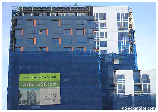
As a number of plugged-in readers have noted, Arterra has selectively started to shed its Bovis blue wrapper (which we really think should have been green). And while they were aiming for a spring opening last July, at this point we have more than just a feeling that summer might be the new new target.
∙ Arterra (300 Berry) Tops Off At 16 And Aims For A Spring ’08 Opening [SocketSite]

So far so good and I think better than expected, the building has kept the clean look from the model and marketing photos and no stucco 🙂
I agree – better than expected. The renderings made it look impossibly dull, so this is a pleasant suprise.
there’s something about this building that i just love. could be the color accents.. but overall the design seems more fitting for the area.
hopefully all the remaining plots in mission bay will have interesting design like the arterra.
looking forward to seeing the complete building soon. it has a spunky personality.
The orange accents do look cool.
Other developers should take a lesson from Arterra. It is better to underwhelm us with the renderings and then exceed our expectations than the other way around.
Great job so far. I’ve always been a fan of Arterra and the building looks better than I imagined.
They will start closing late summer. I spoke with the sales office 2 weeks ago and they were over 50% reserved. They will also have a cafe on the corner of Berry and 5th.
I wonder will there be any fallout here? With people giving up their deposits at One Rincon Hill, I wonder will it be the same at The Arterra? They’ve presold a lot of units before the credit mess.
It looks great; I can’t wait to close. And jk, I have 95% of my down payment and closing costs already cashed out of stocks,in addition, interest rates are lower than when I bought (before the credit mess) so, NO, I will not be giving up my deposit.
Beautiful! ! Mission Bay and SF at large still has an opportunity to create fabulous 21st century design and living space.
Wait, after reading for months and months and months about the lame and leaving-much-to-be-desired architecture San Francisco is supposed to be plagued with, its THIS that calms the masses? I’m am absolutely not an expert on design and things of that sort–I’m just an average guy with everyday tastes who thinks the Fed building is kinda cool, Infinity is pretty but short and squat, and ORH is so-so. But for this to be the one that silences the gnashing of teeth I’ve been reading on this sight is truly confusing. I mean it’s alllllright, but really? (I think this is where I’m obliged to say that I know–KNOW!–that this would never play in Chicago.)
I think the underlying theme here is that the building never claimed to be something special, like the places you mention do, and the result is fairly nice.
It takes more than paint to create architecture and the only thing even slightly interesting about this building is a few orange brushstrokes.
I’m definitely not convinced.
Stop teasing me! Strip it all off!
Because the orange highlights are located where the windows are recessed and along the top of the window, they will appear to fade in and out as you move along the building, making the look of the building change with where you are located. When all the wrapping is gone, I think people will be even more excited by the unique design
this looks like an office building in South San Francisco…
I guess the architect is an Illini fan?
..it’s just orange is the ‘new’ contemporary color.
this building, while not mind-blowing architecture, is a great example of what contemporary condo architecture could be.
ARterra reminds me of a fairly common type of building you might see in the Netherlands/Germany. Which is a good thing for SF.
compared to the rest of the buildings in Mission Bay .. this has a personality, at least. I’ve studied the renderings many a time.. and when the building is completely unveiled it should look interesteing at all angles. especially street level. which is really key for the neighborhood.
This guy is right -‘native_son’ at March 19, 2008 6:46 PM “…the building never claimed to be something special…” The building is not special and never will be. It is just looks bad! The colors, the massing, the stile….sorry there is no stile.
This guy is right -‘native_son’ at March 19, 2008 6:46 PM “…the building never claimed to be something special…” The building is not special and never will be. It is just looks bad! The colors, the massing, the stile….sorry there is no stile.
What all this tells me is that San Franciscans are starving for good interesting architecture. If they cannot get a five star meal, at least a warm hamburger will do. Why can’t we raise the bar a little higher in our expectations?
From Miami to Seattle, from San Francisco to Chicago–you gotta love how a tidal wave of new condo supply is intersecting with the bursting of the bubble. Classic.
Anyone with experience on deals at arterra? How much off the list price is possible?