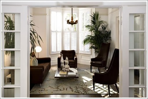
So here’s the regular scoop on 2062–2064 Pine: it’s a two unit TIC building without parking (other than a leased spot elsewhere); both units are owner occupied and on the market; and as far as we know, offers are being accepted next Tuesday (2/5).

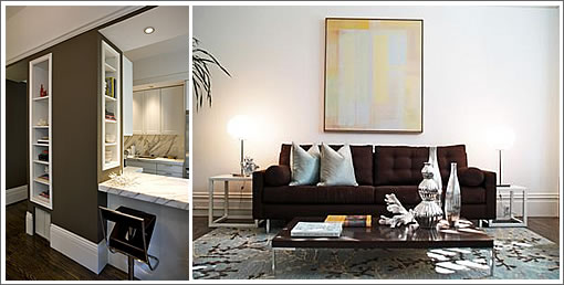
And here’s the inside scoop: the condo conversion ball is already rolling with tentative approval of the condo map in hand (legal counsel is definitely in order with regard to the impact of any transfers in title); and if the lower unit looks staged, it should as it’s the soon to be ex-home of the principals of the San Francisco staging company responsible for bringing “chopped” pillows to the San Francisco staging scene (or so we’ve been told).
∙ Listing: 2062 Pine Street (2/2.5) – $999,000 [MLS]
∙ Listing: 2064 Pine Street (2/1) – $749,000 [MLS]

15 years ago I used to party for days at a house directly across the street from this one.
Thank you for letting me know who started the “chopped pillow” fad. For some reason I really hate them (I know, get a life) and will be glad when we get back to normal pillows. Do you think the homes of staging company owners always looks this staged? Enquiring minds want to know.
What are chopped pillows?
Ditto to McBravio, please what are “chopped pillows”?
the two white pillows on the brown sofa look like they took a karate chop.
you have got to be kidding me–$1 million dollars and no parking spots! Maybe if it was a 2 bdr, 2 bath right downtown next to the Embarcadero station or Powell station, but this is pac heights–you need and want a car (I would still want a parking spot for $1 million downtown).
Regarding the staging company responsible for chopped pillows, and other crimes against humanity, what is the name of that company? I am curious only in that their look has so completely over-saturated the residential interior design scene in San Francisco at the moment. I myself find their style more Miami-Los Angeles than San Francisco, and would have wished instead that someone like John Wheatman and Assoc., or some other Bay Area Regionalist who works in a design vocabulary that relates more to a Nothern Pacific context that includes more Asian and natural influences would have been the designer of choice among realtors for staging their properties. Why must EVERYTHING look like a Kelly Westler Palm Springs cocktail lounge? (Which is obviously where this staging company takes design inspiration from)
it’s funny… I never even NOTICED chopped pillows until Socketsite mentioned them.
And then I started seeing them EVERYWHERE…
and then a funny thing happened, I started hating them too!
sometimes my pillows at home will spontaeously self-chop. when they do, I fluff them right back up now!
One of them is notorious for doing that, so I added more stuffing.
Just funny how little things can irritate you!
I for one could easily deal with the cessation of the light silvery-blue/chocolate color combination. it’s everywhere.
@ex-SFer
“I for one could easily deal with the cessation of the light silvery-blue/chocolate color combination. it’s everywhere.”
Yes. I call it AquaTurd ™. The neighbor across the street from me painted their whole building that way. Rather than stare at a swiming pool full of poo, I moved away.
Anybody know the square footage or explored the possibility of adding a garage?
@vox:
ROFL. Aquaturd. I have to remember that. I will always footnote you though!
Just walked through the lower unit 2/2.5. The layout is a bit screwy with a full bathroom behind the kitchen at the rear of the apartment. There are no bedrooms on the main level, so your guests, kids, etc. are walking through the kitchen, dining room and front hallway to shower and get back to their bedroom. This place is ideal for someone a) without children, b) don’t mind your guests lack of sleep given the road noise from pine. While the living space feels fantastic (living room, dining room, kitchen out to the backyard…the sleeping/bathroom arrangements are poor at best. Swap the 1/2 bath downstairs with the full up and this place is worth 1.2M.
smallest. kitchen. ever.
I have no idea what the inside of that place looks like. The pictures are useless. They are all close-ups of the staging furniture/fixtures/appliances. It gave me no idea what the rooms look like or how they were laid out. Thanks to GangusK, now I know why.
The staging comments are always the funniest things people seem to come up with on here. I agree the sameness is banal and probably not Northern California. But who cares? The object is to show perspective buyers how to use a home, not to sell furniture or art. (Well, occasionally to sell art.)
Anybody ever write down an artist’s name from a painting at a staged home? Someone at an open house asked me who the painter was for a painting recently. I didn’t know … I didn’t stage the home. I asked her to call or email me and I’d find out fromt he stager. She never did.
Staging is big business in San Francisco and the Bay Area – as in many parts of the country.
“Staging is big business in San Francisco and the Bay Area – as in many parts of the country.”
Is that true? I love looking at the upper end properties in NYC, the westside of Los Angeles, and Chicago online, and I am always suprised how much variety they have. What is interesting is how may of those properties show the personality of the owners instead of the stagers, and I really don’t see any of the AQUATURD (copyright by VOX) that seems to be everywhere in this city. It really is getting to the point where when I walk into a place I am saying “Oh not THAT again” as much of this art and furniture gets recycled again and again and again.
sometimes i spontaneously self-chop
“Chopped” pillows have been around for years and I don’t believe that they originated here. I’ve seen some of Michael Taylor’s rooms, including Auberge du Soleil, that had oversized “chopped” pillows.
And I found a photo from 1982 of a Parish-Hadley room in NYC that had “chopped” pillows. Chopped liver. Chopped steak, aka hamburger. Chopped pillows. Their creators may be lost in the mists of time.
Upstairs unit is tired. Downstairs unit is better but the lower floor feels a little bit like a dungeon. And the noise off Pine St. is brutal even yesterday it was off the hook. This would be a real pain with no parking.
No parking = forget it.
This place has IMHO, the best of both worlds: Old San Francisco Style with a contemporary twist. The location is good, walkable to Fillmore Street. It sits back enough off Pine Street so the traffic is not that much of an issue.
Funny all the comments on here about staging! The whole point of staging a property is to give potential buyers the IDEA of how a space may be used and to give scale to rooms. Whoever this staging company, they’re cool! My personal taste lends itself more to Dwell magazine as opposed to back issues of Architectural Digest circa 1988. But that is just me. Chop on.