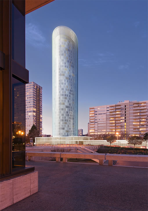
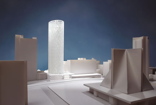
J.K. Dineen at the San Francisco Business Times delves deeper into the proposed Cathedral Hill tower to rise at 1481 Post Street and uncovers some coveted renderings.
San Francisco real estate tips, trends and the local scoop: "Plug In" to SocketSite™


J.K. Dineen at the San Francisco Business Times delves deeper into the proposed Cathedral Hill tower to rise at 1481 Post Street and uncovers some coveted renderings.
I like it. It’s a classic, timeless design (although its not that original, but that’s OK). It reminds me of some of the 60’s/70’s residential towers in Chicago I remember when I was growing up in the Chicago-land area.
I think the final finish materials will really tell us how classic it will be…
I am just starting to really notice building design so I can’t put this in hisorical context but I instantly liked this builidng. It is very appealing to me. Very sleek and clean looking
I have the opposite reaction when I see the renderings of many of the other new buildings planned for SF
Wow, I love it. Can’t wait to see it when finished.
Aha, that’s gorgeous. Do correct me, someone, but this would be the first significant high rise West of Van Ness in, what, 30 years? 40 years? What?
Love it!
now there ya go….a REAL building. great alignment with cathedral across Geary.
Multiple towers of that type should line this section of the hill/Geary.
Its only problem is its next to the Sequoia monstrosity.
I disagree. It’s way too tall for the area and crowded into a small space between 2 buildings on the same block. It’s hard to judge the beauty of the thing from these drawings, but it may or may not look beautiful or ugly. I think that anything on this site should be along the same axis of the (admittedly awful) Sequoia and not perpendicular as this building will be..
Thumbs down.
it’s stunning, the exterior and ‘crown’ appear to float around an inner tower reminding the viewer of the fog enveloping the buildings of San Francisco.
The tower itself pays tribute to the design of Coit Tower without being stuck in the past.
It is an excellent design that takes inspiration from San Francisco’s past and natural environment and is nicely balanced by the two shorter towers to the North and South as well as the Catherdral to the west.
This is a great building. I don’t think the Sequoia is that bad– It’s just a little boxy and sticks up all by itself. A few more tall neighbors is all it needs. Love it!!
I like the design, and am generally never dissapointed with SOM’s work. Dont know much about the context of the building/ site however.
I wish the public would demand and Architecture firms would start to share schematic sections through the skin. Computer rederings (as we’ve seen at One Rincon) can be slightly deceptive and now with advances in rednering software, its easy to make anything look dramatic.
Is it infact a double skin? Click my name to see a building in Barcelona which 2 skins, so to speak. Torre Agbar by Jean Nouvel
i know, this is all very subjective, but this is really a retread of a fairly used up design. look at the norman foster st mary axe in london recently, or philip johnson lipstick building in nyc 20+ years ago. heller manus put another spin on same tire at base of transamerica lately. this building has a 2007 date stamp on it-predict it will age poorly if ever built. kind of a one liner. If executed and detailed perfectly it may be different….but spec developments rarely are. gap between rendering and reality could not be illustrated better then at one rincon.
Would fit in south of market or in the financial district, but does not belong in the Cathedral Hill area. No hirise that tall does. That’s a defining feature of SF, having its tall buildings on the water front. We’re not NY. You’ll loose the slopes and curves of this hilly city. 2nd its a cyclyndrical eyesore with no peers. Oh right it fits in nicely with the neighboring “artist 70’s” building next door. Scale it down by 1/2 and at least it will fit in highthwise, but thats all of the fitting in it will achieve. Its not the right location for this building. Beyond its own style how will it truely fit in?
Overall, this tower, though not unique, is far better multi-unit residential design than SF has been typically force-fed (i.e. the Heller Manus crap all over the place). I don’t think this is too tall for the area either — seems in scale with the cathedral, the hill and that part of Geary.
Not convinced that the best design here is necessarily an ‘object building’ (i.e. the curvilinear tower shaft being geometrically autonomous from the orthogonal urban fabric — it used to be that buildings arguably more important than housing stock deployed such morphological tactics, like St Mary’s itself). And I’m not convinced about the design of the base/podium though, it looks a bit anemic.
But overall, it raises the bar above the horribly banal residential developments we’ve come to expect in SF…
Dear Socketsite readers:
I read with great interest your submissions regarding the new tower that is being proposed for Cathedral Hill. We are the developers of the project and it is nice to find supportive voices for the type of elegant infill development that we are proposing. I would like to invite you to see our new website at http://www.1481poststreet.com. There is additional information about the proposed development, architectural renderings of the new building, community information, and a comment page to provide input, as well as signing up for e-mails regarding the progress and future community meetings.
We would love to keep you informed as the development moves forward through the approvals process. Thanks again for your positive comments.
Sincerely,
Linda Corso
lcorso@chpapt.com
ADCO Group
I am an instructor at the Academy of Art U. Our class has projects related to the San Francisco Japan town. We are very much impressed by the Cathedral tower. Please keep us informed and also please visit our class web site when you have a chance.
http://www.projectJT.com