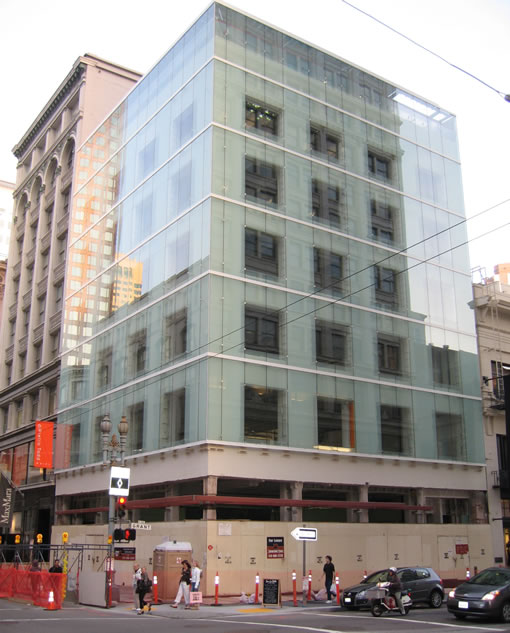
And yet another “plugged in” tipster captures 185 Post’s glass wrapped makeover by Brand + Allen Architects taking shape. It’s a modern aesthetic without the edginess of the controversial Koolhass design that was once destined for the location.
∙ Ghostly restoration of 1908 building would be the newest thing in town [SFGate]
∙ John King Does Rem Koolhaas [SocketSite]

The picture doesn’t do the building justice – maybe. In person and up close (I’ve alsways been too busy looking out for traffic at the intersection when walking by; not really taking the time to take a good hard look at the building), it looks more interesting.
The photo makes it look like the building is being quarantined becasuse it was used as a superfund cleanup repository…
A little on the odd side, but still a definite improvement from the deteriorating 50’s style siding and windows from before—not to mention the fact the building’s been empty for years. I’ll bet it’ll look nice all illuminated through the glass at night.
It’s an interesting idea to encase an old building in a glass box. I’m not excited by it for sure but it’s better than before.
What happens if there is a moderate earthquake and the glass breaks? I don’t want to be in the neighborhood when that happens. Just thinking outside the glass box, so to speak.
Anyone know what retail/office tenants will be moving into this building?
“What happens if there is a moderate earthquake and the glass breaks?”…
I suppose it will join the millions of other windows in downtown San Francisco and either break, or not.
The building looks quite cool from up close. The glass, which is seriously fastened, creates a diorama-like effect over the raw concrete.
No big deal in an earthquake, the glass is in tight enough to hold against the wind, but in a quake, the glass just slides around and doesn’t shatter. I was on the 17th floor of 425 Market Street in the 89 quake, and the windows shifted around to where you could slide your hand out of the edge, but none of them broke.
I don’t recall it being a big effort to slide them back. By the time we came into work, almost all of them had been slid back into position.
A bigger problem could be the wind whooshing down along that flat, unbroken vertical surface from above, but the building isn’t that tall: I doubt it will be that bad.
I think it looks cool.
And it would be a good place to put investors of former high flyers like New Century in there: when things get bad, the investors can open up their interior windows and jump out, but they won’t get very far: the external glass will stop them.
If I recall from an article John King wrote when this design was unveiled, once complete the building will be lit from behind the glass to give it a ghostly quality at night. Sounds very cool.
[Editor’s Note: A link to the John King article is provided in the post above.]
So much better than what Rem had wanted to slap on this building for Prada. Just goes to show that “Starchitects” are more about fashion then good design at times and have little regard for the individual characteristics of the cities they do projects in. Brand + Allen have come up with a brilliant solution! Congradulations.
8:23 – “little regard for the individual characteristics of the cities they do projects in”???
Rem’s facade for this building fit in 10x better than a sheet of glass! His exterior at least delineated the floors – a very distinct characteristic of the surrounding older buildings. While the SF Planning Dept. may go overboard with wanting new architecture to look old, I’m very surprised that something with NO architectural detail was allowed.
And as for Brand + Allen’s “brilliant” solution (which is really not a “solution” at all, it’s just a glass facade)- all they did was replace the outrageously expensive stainless steel facade that Rem had with glass instead. They were Rem’s local architect, so they already had all the other drawings.
The glass WILL break, btw, in a large earthquake. Neiman Marcus’ glass entry shattered in ’89 and it’s expected that in a large earthquake, the streets could fill with as much as 3 feet of glass. Stay indoors.
“His exterior at least delineated the floors”
Oh come on….what sour grapes! Look at the picture…the horizontal bands are perfectly clear in the joints between the sheets of glass, AND they line up with the neighboring building. Plus, the fact that you can see the original fenestration behind the new glass curtain wall only reinforces this delineation.
I like this one much more than the other. Ghostly is right! The other was, frankly, dull.