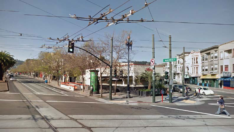
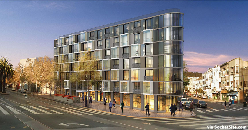
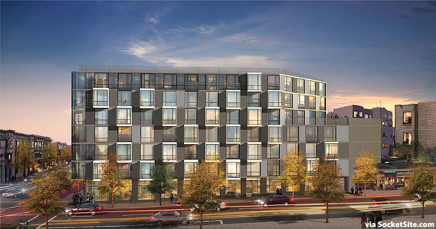
The plans for razing the long-shuttered Home restaurant at the Corner of Market and Church and constructing a four to seven-story building on the 2100 Market Street site were approved earlier this year, but with a number of conditions which included a redesign of the previously redesigned project:
The building’s bay columns have been removed in favor of more randomly organized bay windows, with projecting bays and Juliet balconies.
In addition, metal panels have taken the place of the previously proposed smooth plaster cladding; the two ground-floor residential units on 14th Street frontage were replaced with a 1,050 square foot retail unit; the main retail space fronting Market has been enlarged from 2,600 to 3,000 square feet; and a 4th floor roof deck has been added along 14th Street as well.
As a result, the 2100 Market Street project will now yield 60 apartments – a mix of 6 studios, 30 one-bedrooms, and 24 two-bedrooms – over two restaurant/retail spaces totaling 4,100 square feet and an interior storage room for 60 bikes.
Having sat vacant since 2011, Chipotle had planned to renovate and occupy the existing 2100 Market Street building, but those plans were rejected by San Francisco’s Planning Commission in 2013. Brian Spiers Development, the developer behind Linea down the street at 1998 Market is leading the charge this time around.
Once the ground is broken, it should take roughly 20 months to develop the project. That being said, it doesn’t appear any of the paperwork has been filed to secure the actual building permits for the project. We’ll keep you posted and plugged-in.


built it. That corner is one of the most convenient places for people to live, (near multiple transit and multiple grocery stores.) Right now it is such a blight.
Another mediocre design. The previous design was a lot better. It actually had a varied roofline. And the previous façade was somewhat interesting. This new one – meh.
Is it me or does the new window treatment look somewhat like what is proposed for the Dim Sum place at Folsom and Hawthorne?
Well, I suppose you can call that a better design, even if it’s underwhelming… at least it’s less like an office building than the prior iteration.
Good thing our anti-parking silliness is saving the builder the expense of digging a hole…
Can’t dig a hole – Muni Church Street station and tunnel are down there.
There’s nothing silly about it. Not every project needs parking, especially those on top of a major transit line. You’re under the impression that all residents want to own a vehicle.
Especially when there are probably multiple Twitter carpetbaggers for each unit, who would love to have a simple 20min F-Market ride to work.
Taller base floor design (better retail) with thin columns, and lit street-frontage, even an open corner due to street foot traffic – add floors to top (should be upwards 6-8 floors approx.) add some form of materials/color, the project by the mint, already played with the mundane material palette…and lost. and definitely need a roof-top design/structure or element, currently looks like the building got a “flat-top”…
Well, the new design is what is getting built. The project was approved subject to these redesign conditions. And, the city is certainly not going to give the building a zoning exemption to be built taller.
It is what it is–a decent building, nothing too exciting, but a nice addition to the corner. And, it certainly is much better than that ugly one-story, pissed covered abandoned building that has been there for years now.
The initial design was better than the previous revised iteration, and this is the best of the lot. Can’t be built soon enough to replace that forlorn property.
As it’s sitting literally above a subway station and across the street from a supermarket, it really should be twice as tall. Safeway could also do what they did at the Beacon and build a skyscraper over it’s parking lot.
I especially like the addition of the rounded corner treatment on the upper floors. The variation in the bay windows and balconies helps break the facade up much more effectively than that previous design. Definitely looking forward to this lot being built up.
Oh my gosh. Will all the amateur architects shuddup and let this thing get built. This is a crime ridden, disgusting corner of SF. It’s fine. Build it.
This construction is going to cause traffic mess of epic proportion.
Aw c’mon now. It won’t be that bad. Other buildings get built at busy intersections. Using all of the metrics cited in the criticisms, it’s a wonder anything ever gets built anywhere.
The construction project at 2198 Market has impacted the neighborhood’s traffic and street parking. It would be great if the project at 2100 Market started after the project at 2198 finished.
Uh, why is it tiny? Should be at *least* ten stories, ideally 15 to 20. No wonder we have a housing crisis with centrally located sites being wasted like this. When does this area’s zoning come up for revision?
That these corners were turned into weird skinny wildly expensive condo thingy’s — instead of being turned into lovely people-oriented public pocket parks (most such spaces world-wide have been) is testimony to how wasted our now $9 billion city budget really is, and how utterly sold out this city has become. Its astonishing and the blame reaches from the leftmost corner to the rightmost.
We need more housing way more than we need a 250 square foot park (and I won’t even make the obvious comments about what sort of clientele a park at that location would attract…)
Dolores and Duboce park is just minutes away. We don’t need another park at this corner.
Maybe people are tired of all the parks being turned into homeless encampments, and that people that pay taxes in this city actually want land to be put to use?
I’ve seen many a longtime SF homeless encampment turned into parks, and into office buildings, and luxury condos, and chain stores, and even into a baseball arena. Many and for a longtime.
“This land is too valuable to permit poor people to park on it.” – Justin Herman, former Executive Director of the San Francisco Redevelopment Agency, 1970.
That is an ironic statement when you think about the poor people that camp at Justin Herman plaza.
Hyperbole aside, I said nothing about “poor people.”
Sorry for the confusion, trevor. I was referring to the quote attributed to Justin Herman in Jake’s post.
@SFCitizen I was actually responding to Jake. Equating not wanting homeless, drug addicts, and derelicts to take over public lands with a hatred towards poor people was uncalled for and incongruous with my earlier statement. But yes, Justin Herman Plaza is a perfect example of what the city should not be tolerating.
Many of those now “public lands” were formerly housing for poor people and some homeless people. Skid Row ran right through Yerba Buena in SoMa before it was turned into a park and a convention center and … for the benefit of …. Mission Bay had one of the largest homeless encampments in SF before it was turned into … for the benefit of …. As did the area under the old elevated fwy along Folsom and by the old bus terminal, before they were turned into … for the benefit of ….
The only incongruity is among those who would dispose other people for their own benefit yet tire before they finish the job. Justin Herman said a lot of things, many of them similar to your first comment above. He gutted entire neighborhoods with just that kind of attitude and backing. Maybe someday we will build a Trevor Fountain in SF.
FWIW, I wrote a comment not an equation.
I agree.
Its called crony capitalism.
The only solution is a planning requirement that large projects be required not build out their lots to the full envelope.
At one time this was done – that is how we got the Transamerica park, Chevron Gardens and that small sliver of open space with the beautiful fountain at the Hyatt on Union Square.
What planet are you from? There has NEVER been a park at that location. It has been one commercial building or another for generations. How is it “crony capitalism” to allow a crappy, abandoned, one story pissed covered building to be torn down and replaced with a decent looking apartment building with street-level retail? I guess the developer could have just followed the current use and scrubbed up the existing building and opened another mediocre restaurant, but that would not have yielded the city a park either.
Thank God you have no control over planning in our city, or we would have even more empty buildings sitting to rot than we do now.
It is a decent building, nothing special, but decent and that is all we need.
Hey Dave, what part of your house are you donating to public use?
There is a mini park of sorts, across the street. The area around the steps that go up into the safeway parking lot from Church/Market. I walked through there yesterday with my groceries and saw a junkie shooting up on my right and a dirtbag taking a crap in the bushes on my left
Well, if we gave free needles and free places to defecate (which will be treated so very well by their benefiting population) everything would be better. We should also give the feral population sparkly rainbow ponies so they can fly around the city raining pixie dust and love on us benighted worker bees.
Why ever would anyone think this very busy corner would be a good place for a park? Hard to imagine a worse place for open space. And anyway this is a city not a suburb. Buildings in cities go to the lot line; buildings in suburbs have postage stamps of open space around them…witness Mission Bay if you like the suburban feel in the city.
Regarding when the “zoning come up for revision” this was the first product of the Better Neighborhoods planning process that began in the year 2000…and took 8 years to complete: the Market Octavia Plan (at which time some new arrivals in town yelled “you’re rushing this through”). No way will this plan come up for revision…and if it did, the NIMBYs would assure that building heights be decreased not increased.
I’m a little confused by your comment about Mission Bay and postage stamp sized open spaces. Most of the buildings in Mission Bay are built to the lot lines. Some of the condos have token outdoor gardens, but nothing resembling postage stamp sized open spaces.
The open spaces I am aware of are pretty expansive considering the density here. We have the strip of parkland between UCSF and the condo area of Mission Bay. We have the open space by the houseboats. There is the park by the hospital. UCSF has a pretty large open space in the center of the campus, and many of the buildings have large seating areas outside. Once the Arena is built we will have another large park. The smallest open space I can think of is by Kaiser’s building.
“this is a city, not a suburb…”
Very true. But, across the street from this site is a suburban-style shopping center.
Thanks for the link. It seems like we tend to put our density in less desirable areas, whether it’s Market/Van Ness or most of SoMa, because they have less “character” in the first place to destroy. But growth can make a successful neighborhood’s character even better, adding variety and interest and letting more people enjoy the neighborhood. Hopefully that view will become more mainstream here with the work of groups like Grow SF and their supporters (I’m one).
Sad this development is at such a suburban scale but guess we just need to focus on building the next one bigger.
This location was always zoned for 85′ prior to and after approval of the Market/Octavia plan. It was only after a neighborhood group complained to the BOS was it then lowered to 65′ – agree with comments that this is definitely a missed opportunity for more density.
Another over-sized building, should be four stories no more. Apart from the developer cronies on this site the appeal of taller buildings has strictly limited appeal. It is not hard to see why – bland, monsters are ruining SF.
Looks great. Build it!
We have invested billions of dollars in Muni Metro that has a stop right at this site, which also has a confluence of bus routes, and someone wants it downzoned to 4 stories? That kind of non-thinking is precisely why we have a housing crisis.