As a plugged-in reader moving to San Francisco and house hunting reported in March:
On February 28, 716 Sanchez Street hit the market with a list of $2.45M for the 2100 sqft house. That comes to a whopping $1187/sqft which is way out of whack with both comps and listing in the neighborhood.
When I checked back on March 2, the listing had been “updated”. The only change was that the number of square feet was removed! I suppose that’s one way to make the place look more reasonably priced.
As we noted at the time, the fully renovated 716 Sanchez had first been listed for sale in 2008 asking $2,650,000 ($1,262 per square foot) having been purchased for $1,175,000 in 2003 as a much less modern 1,250 square foot home.
And while we took a bit of heat for running the story, the list price for 716 Sanchez has been reduced a few times since. They’re now down to $1,999,000 ($951 per square).

∙ Listing: 716 Sanchez (3/2) 2,100 sqft – $1,999,000 [716sanchez.com] [MLS]
∙ Price Per Square Foot Out Of Whack? Reduce Remove It… [SocketSite]
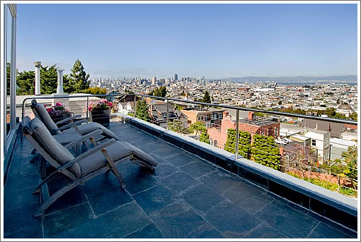
I predict a sale soon now that the price is more reasonable. The place has killer views and is on a great block.
And what’s happened in the 121 days this property has sat? 3965 20th and 4110 20th both sold for around $850/sqft. At $2M, the place still looks overpriced.
If they have to lower further, it would be funny if they started to quote the $/sq ft as a marketing tool– given the other thread on this.
$850/sf is a very good price. I’d be careful rejecting offers in this price range. Summers can be cruel.
Must have taken that picture on a clear sunny day (prolly around 10 days during the year). Typically this area is foggy.
The area is not very foggy and the views are indeed great. I have seen the place twice. The real reason why it is not selling is that it has an impossible design if you have a kid. It works only for a single or for a couple with no kids.
yeah, SFWatcher, this area is not foggy at all. And in fact is protected from much of the cruel west wind by Dolores Heights. It’s a very sweet location indeed.
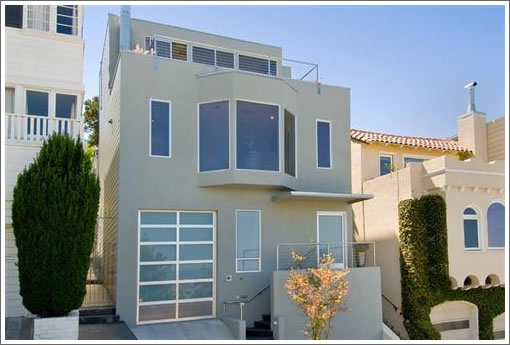
Ditto on the no fog. From walking by with the dogs, the curb appeal is grotesque. They stripped the period details and then did not completely commit to the modern esthetic.
sfwatcher obviously has never been to this awesome neighborhood. It is never foggy here. It is sunny and warm, and very close to Dolores beach where all the boys hang out.
so to speak.
enrico -what does “an impossible design if you have a kid” mean
In the 5th from the end picture of a bathroom and toilet there is some interest plumbing attachments by the toilet. A set up for a later to be added bidet or just a warm water rinse for the toilet patron?
@SF Watcher: Not true. I live in the area and have a similar view which I get to enjoy most of the year, day and/or night.
Impossible design: The lower level “bedroom” has an L-shape that doesn’t fit a full sized bed (much less a queen) nor will it work as a TV room. There’s also no bathroom on this level, so all in all that room is pretty much a write off, making this functionally a 2 bedroom. The kitchen has almost no counter space, so it’s definitely not designed for those who like to cook. The only view-balcony is off the enormous master suite, though the view from the living room is spectacular. While the interior is nicely done with high ceilings and spacious rooms (except the aforementioned non-room), the exterior is hideous, and there isn’t much you can so to fix it.
All in all the demographic that will be interested in this place is small: no kids, not in to cooking, don’t mind negative curb appeal but love interior design.
@Enrico: I agree that the layout/design might work better for a Single or Couple, rather than for a young family. Our house, at 2600 sq ft is a mere 2/2 … it works perfectly well for a couple, like ourselves, who don’t have kids and entertain often … much like the 4 other couples who lived in the same house before us.
“They stripped the period details and then did not completely commit to the modern esthetic.”
Bravo Marten, that’s probably the most concise facade critique possible.
—-
The claims about the fog situation above have reached both ridiculous extremes: from ten sunny days a year to no fog at all. The reality lies somewhere in between. All I’ll say is more fog than the Mission but less than the upper Haight.
Where’s Baghdad-by-the-Bay Bob to tell us that the original pricing wasn’t out of whack given the comps?
As plugged-in tipster mentioned:
3965 20th: 2475 sqft 4/3 sold at $2.075M, after a previous sale at $2.3M in 2007. Tax records say 4/1 with 2212 sqft, so there was work done.
http://www.redfin.com/CA/San-Francisco/3965-20th-St-94114/home/1549695
4110 20th: not sure on square footage, but listing says 3/2 sold at $1.455M (almost $100K below asking), after selling for $1.255M in 2000. Tax records say 2/1 with 1472 finished sqft and 813 unfinished, but I imagine some of that unfinished was finished in the remodel.
http://www.redfin.com/CA/San-Francisco/4110-20th-St-94114/home/2000918
This house has a lot going for it, as well as some quirks, but they took themselves out of the game.
Not only is the exterior a horrible attempt at modernism, but the interior falls very flat as well, who did the lighting plan, was there any thought put in, look at the can placing all around, nothing lines up and nothing is spaced in relationship to eachother, I typically like rectangular trimless can but here they look horrible and theres way to many. Also why in a place this size is the kitchen so small and cabinetry so sparce.The Material palette is also very strange and busy for something trying to pass off as modern…My favorite things here are the view and the hot tub
Many fine automobiles would be considerably less fine after trying to negotiate that interesting driveway.
Maybe that is why the garage door appears so tall, so you can park your big wheel SUV.
Hey, where is NoeArch (aka the Noe Artichoke) to give us his two cents these days? I’ve really missed his input!!! 😉
Did he change his name? Did the Internet connection to his Mom’s basement fail?
NoeArch we miss you!!!!!
noearch got a job, so he’s busy getting paid for his opinions. Let’s let sleeping dogs lie!
I like to think he’s working on the plans for sparky-b’s next project.
for the price i’d rather get 100 palo alto
Sadly we have not worked together. But it’s really a matter of time I’m sure he’ll have me bid whatever it is that’s keeping him off SS.
@sparky-b, Congrats on your last gig. But I have to ask about the front door. An artist? Leftovers from the wood shop? A recommendation from your real estate agent? I can’t imagine it came from home depot.
EBGUY,
Thanks. I fancy myself an artist, so yes built by an artist. It is scraps from the cabinet shop, mostly of the wood used inside the house. Nobody recommended it, I just thought it would look good.
Good comments on this place. Other negatives: not much shopping/restaurants/stores within a comfortable walking distance and its a very steep hike to/from the N Judah.
But the view is really one of the best in the city.
I meant the “J Church.”
Sparky-B, what property are they commenting on regading the creative front door? Valley?
yes.
Original house suffered a terrible remodel with cheap facade, horribly cheap windows, and bad interior finishes. Needs 500K to fix.